Subscribe now

Health

5 graphs that show how the world suddenly changed when covid-19 hit

From carbon emissions to the share price of videoconferencing firm Zoom, these graphs tell the story of how the covid-19 pandemic changed everything

6 January 2025

Graphs and data were vital to understanding the spread of the coronavirus

Daniel Leal-Olivas – WPA Pool/Getty Images

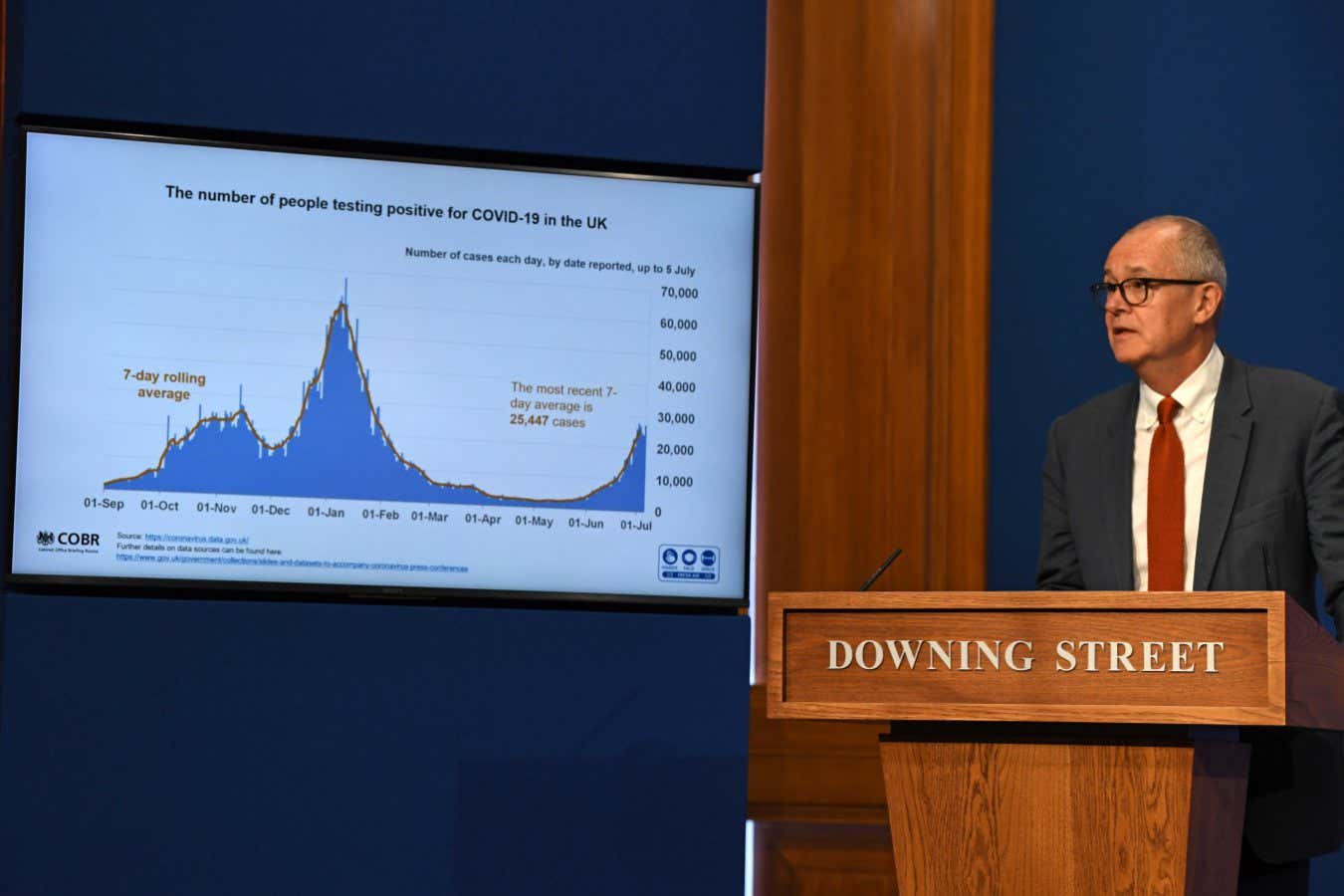
As the covid-19 pandemic took hold, the world was transfixed and transformed while we came to terms with just how vulnerable society is to a deadly virus. These five graphs highlight just some of these changes, and show how close things are to returning to “normal”.

Sign up to our weekly newsletter

Receive a weekly dose of discovery in your inbox. We'll also keep you up to date with New Scientist events and special offers.

Sign up

To continue reading, subscribe today with our introductory offers

Popular articles

Trending New Scientist articles

Piano Exit Overlay Banner Mobile Piano Exit Overlay Banner Desktop